1/25/2006

This kind of thing really bugs me

Filed under: — dave @ 11:09 am

I hate it when the popular press leaps on a “new scientific discovery,” and it turns out that the research hasn’t even been published yet. Such is the case with this research on brain patterns in political partisans (update: it’s also in the NYT — thanks for pointing that out, Coturnix). Drew Westen claims that members of both parties turn off the rational parts of their brains when presented with contradictions in their candidate’s reasoning. Can we believe Westen? Not when according to his own website, the article’s still being revised.

Why bother with all the talk about how to revise the peer review process, when the popular press touts “discoveries” before they’re even reviewed?

12/6/2005

Pinker, research, and race

Filed under: — dave @ 4:20 pm

Steven Pinker has changed. In The Language Instinct he wrote brilliantly about the evolution of language and the means by which humans came to be the only thinking animals. He wrote about how the similarities that bind the different races of humans were vastly more common and interesting than a few paltry racial differences.

A few years later, when he wrote How the Mind Works, the emphasis had begun to show signs of movement. He was writing much more about IQ differences, but still these chapters consisted of just a fraction of the book.

I haven’t read The Blank Slate, but from what I’ve heard, it “progresses” even further in the same direction. Now he’s giving lectures about Jewish intellectual superiority. I understand that in every case, he’s careful to point out that racism is wrong, but still, I wonder why he’s now devoting so much time to those differences he once dismissed as insignificant.

Take a look at yesterday’s post in Cognitive Daily. Like most psychology research, this study found no racial differences. Like many studies, this one actively tried to find differences, but observed none. It found that as we age, whether we’re black or white, emotion begins to color our memory and reaction to faces. Black or white, our behaviors are the same, as they are in countless other studies. But Pinker chooses to focus on one study that tries to explain why there are so many Jewish lawyers and doctors. Did Pinker suddenly learn that Jews tend to score better on IQ tests than other racial groups? I’d submit that he didn’t — he’s just talking about it more now.

And why shouldn’t we talk about it? After all, it’s true.

Well, it’s also true that New Yorkers are better at navigating the subway than Kansans, and that sons of cellists are likely to be better cello players than sons of bricklayers. Maybe we should talk about that. It’s true. Boring, but true.

Even if IQ is largely inherited, and even if IQ really predicts future success, I’m still unclear as to why so many resources get devoted to studying IQ differences. Shouldn’t we be focusing on the things we can reasonably be able to impact? Even if IQ was 100 percent genetic (it’s not), how does that affect the way we should run schools or make hiring decisions? Surely Pinker’s not arguing that we should just do a gene test and slot everyone into their ideal career track at age 4.

Does an 85 IQ really mean you’re slated to be a truck driver, while, say, a 110 qualifies you for middle management? What about football players, or artists? What does IQ say about them? And despite her gloriously high IQ, why is Marilyn vos Savant such a lousy advice columnist? IQ is such a lame, crude measure of ability that it shouldn’t be shocking that so many people with high IQs give it so much credence.

I just wish Steven Pinker was better than that.

7/7/2005

Is this the lamest study ever or what?

Filed under: — dave @ 12:08 pm

On Cognitive Daily, we have editorial standards. We won’t post on a study which we don’t think is worthwhile. Fortunately here I have no such restrictions.

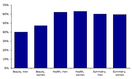
Consider this article from Brain and Cognition: “Appearance of Symmetry, Beauty, and Health in Human Faces.” What the researchers did is to show participants pictures of faces and ask them to rate them for symmetry, beauty, and health. Here’s what they found:

What they’re claiming this means is that beauty has nothing to do with perception of health and symmetry. Because, see, men are rated as less beautiful than women, but equally healthy and symmetrical.

How about looking at the individual faces that were rated lower than average for beauty and seeing if there was any corresponding dip in health and/or symmetry ratings? Or maybe consider men and women separately, since, I don’t know, there could just possibly be different standards of beauty for men and women. Apparently this was too demanding a task for these researchers, because they didn’t do it.

So all we know is that, on average, we rate faces as more healthy and symmetrical than beautiful, and that we think women are more beautiful than men. Call me underwhelmed — and this was published in a peer-reviewed journal.

Fortunately, most articles I read for CogDaily are excellent research. Given how difficult it is to get psychology articles published, I’m shocked that this one got through.

4/27/2005

Now this is good

Filed under: — dave @ 8:52 pm

I have to say, I’m loving Steven Johnson’s new article in NY Times Magazine (thanks, Ben Vershbow). In fact, I can’t wait to get the book.

I was a little disappointed by his previous book, Mind Wide Open, but that might be just a tad unfair, because, psychologically speaking, I’m probably a bit more sophisticated than his baseline reader. But this stuff is good. Popular culture today, Johnson argues, isn’t dumbing us down, it’s smartening us up. Analyze the plot of a typical episode of The Sopranos and compare it to The Dukes of Hazzard, and you’ll see what he’s getting at. Modern audiences expect — demand — more sophisticated plotting than the audiences of 20 years ago. Is it because they’re getting dumber?

My aha! moment came a couple months ago after playing 24 hours of video games with my son. Video games today are immensely more complex than the games I grew up with. The demands on memory alone are astounding.

I spent the past few weeks watching Disney’s new version of Little House on the Prairie with my kids. The complexity of the new show makes the 1970s Michael Landon version look like Saturday morning cartoons (and I don’t doubt that today’s cartoons are also immensely more complex than Hong Kong Phooey or Super Friends). I really think Johnson has a point: contemporary popular culture places significantly more cognitive demands on today’s audience than it did even 25 years ago.

So what’s all this fuss we’re constantly hearing about today’s kids not having the same attention span as kids used to? About their lack of patience, their hyperactivity? If they need to be so smart to deal with contemporary culture, then why do they seem so lacking in other areas?

I suspect these two (admittedly anecdotal) observations aren’t actually incompatible. “Patient” is different from “smart.” The kids of the past had more patience — and they needed it, because their popular culture wasn’t as sophisticated as it is today. Today’s pop culture doesn’t demand patience; it demands mental agility. Teachers and classical musicians are disappointed in today’s kids, because paying attention in school or sitting still for a concert demands patience more than brain power.

Now whether these kids will go on to greatness in the “real world” is probably still an open question. The workplace requires both patience and smarts. Today’s kids have clearly learned the latter; the question is, wil they be able to muster the former?

Update: Turns out Steven Johnson has a blog. Which I would have known if I had actually read Ben’s post. Think I’ll add that one to my links list.

4/19/2005

Happy birthday, Word Munger!

Filed under: — dave @ 8:18 am

Hard to believe, isn’t it? Just one year ago, Word Munger was a tiny babe, almost too fragile to hold in your arms. That’s right, Word Munger sprouted into existence one year ago today. It’s a very merry Word Birthday today, and to celebrate, I’m going to use a tactic mastered by sitcoms the world over: a retrospective episode.

So what wise words did I utter that first day? Be amazed. No, not at the lame-o welcome post, at the comment spam. The next day I wondered whether I should post pictures of my kids online. I concluded that it was probably an irrational fear, but that maybe I shouldn’t be sharing my kids with all the stalkers and riff-raff that would naturally be attracted to my musings about the latest e-book reader. Of course, it didn’t take me long to blow that.

Abortion has been a recurring topic here on Word Munger. A recurring theme of my discussion has been the idea that I wouldn’t make much of a pro-choice advocate.

Another topic I just can’t seem to stop yakking about is e-books. You’d think I could just write a post or two about them and then leave them alone, but somehow, I always come back to the topic. Am I destined to become some sort of e-brarian in a future life? Could there really be that much to say about e-books? Why, if I don’t read a lot of books, am I so obsessed with e-books? Would I suddenly read more if I had a better e-book reader? Stay tuned to Word Munger, because if the past is any indication, you’ll hear a lot more about e-books in the future.

I’ve also written a lot about writing over the past year. A common theme in this topic is my own lack of writing ability. There’s been a bit of self-promotion tossed into the mix, along with a touch of literary posturing.

My travel has been another topic of interest to me. If you weren’t interested, too bad, because that’s what I was writing about.

And what’s with all this writing about technology? If I wasn’t writing about my new computer, I was writing software reviews (this incidentally was the most visited post on Word Munger — ever — thanks to a link from MacBytes). And, of course, the fact that I’m not a designer never stopped me from ranting about design.

I’ve also done my fair share of writing about my neighborhood. It’s … shall we say … suburban. That’s right, folks, my kids are growing up in the kind of place we city kids used to always make fun of. They’re reliant on their parents for every little thing, because even the nearest grocery store is sixteen miles away in a strip mall. Forget about going to the movies on your own, or riding a bus … anywhere. And of course, like any suburbanite, I’m obsessed with my lawn (a man’s gotta have one vice, okay? At least I don’t own an SUV).

Satire has been a feature of Word Munger since before the beginning. That’s right, before there was Word Munger, there was Word Munger, the all-satire, all-the-time predecessor to the Word Munger Blog. I like satire, but eventually it wore on me, and I stopped promising it every Friday. Don’t give up, satire fans, every once in a while I’ll whip up some for you. In the meantime, there’s always Michael Berube.

In these past twelve months, I admit to having done just a bit of writing about Social Security. I even got a comment from the blogosphere’s most famous economist, Brad DeLong.

One topic I never enjoy visiting is my own stupidity. Typically this has to do with my reading an article too fast and then exploding into a rant about what I thought I just read. This post is probably the worst example of it. I’m impressed that Tom Maguire took my idiocy as well as he did.

I have written a few posts about my lack of religious faith. Some are intended to be funny, but others are quite serious. My son Jim, who my wife is attempting to raise as a Presbyterian, read that last one and told me he agreed with it. Uh-oh.

All in all, it’s been a good year. I’ve enjoyed it, so I’ll probably stick around for another one. See you in the blogosphere.
3/1/2005

Introducing Cognitive Daily

Filed under: — dave @ 6:49 am

Cognitive DailyI had mentioned a few days ago that I was working on a “secret” blog. Today I can let you know what secret is: a new site called Cognitive Daily. I’m really excited about this site because it combines two of my passions: writing about neat stuff, and my wife, Margaret Munger. Greta and I have combined forces to create this new site focused entirely on cognitive psychology.

Nearly every day, we’ll report there on exciting developments in cognitive psychology research — everything from how we see things in color to how kids learn language. Though we won’t dumb anything down, we’ll write about the research in ways everyone can understand. (And as regular Word Munger visitors might guess, the “Psychology” entries on Word Munger form the first set of articles on Cognitive Daily.)

Greta is associate professor of psychology at Davidson College and is an expert in visual cognition. Her articles on the subject have appeared in top journals such as Journal of Experimental Psychology: Learning, Memory, and Cognition and Visual Cognition. She is also the author of The History of Psychology: Fundamental Questions, published by Oxford University Press.

I’ve had a great time working with Greta on Cognitive Daily, and I’m thrilled that we’re going to keep working together nearly every day to bring you this new site. So why don’t you head on over there right now? Give it a gander, bookmark it, tell all your friends, blog it, link to it, and comment liberally!

I’ll see you there.

2/17/2005

What are we doing when we watch a movie?

Filed under: — dave @ 2:50 pm

Most schools of literary criticism suggest that it’s fruitless to attempt to consider what the intentions of the author are; we can only examine the “text” itself: it is the only solid evidence we have. Similarly, critics toss up their hands when trying to comprehend the experience of the reader of a text. While the notion of “author” becomes even more complex when we consider film, examining the experience of the film viewer does seem to be attainable: since films are experienced in real time, we can compare the experiences of different viewers while they watch the same portions of a film. We can even chart and compare their body and brain functions across the course of an entire movie.

Monika Suckfüll of University Jena tries to do that in the research she reports in her article “Film Analysis and Psychophysiology: Effects of Moments of Impact and Protagonists” (Media Psychology, 2000). Suckfüll chose to study Jane Campion’s film The Piano, showing it to 62 observers while charting their movements and heart rate. She divided the film into 30-second segments and analyzed it according to Peter Wuss’ theory of film narrative, identifying seven key “moments of impact” in the film, such as when Sam Neill cuts off Holly Hunter’s finger. Suckfüll hypothesized that these moments would be periods of increased attention by film viewers. Previous research has noted that participants’ heart rates tend to decline when they are trying to focus their attention, so monitoring viewers’ heart rates should help confirm or disprove Suckfüll’s hypothesis.

Suckfüll was surprised to find that participants’ heart rates behaved quite unpredictably at these key moments. She did find a correspondence between heart rates and events on the screen, but rather than corresponding to “moments of impact,” they coincided with “topic lines” or motifs. Heart rates rose (signaling anxiety or the “defense reaction”) when the “angel motif” occurred — typically when Anna Paquin was about to betray Hunter. Heart rates declined during the naughty parts (the “sex motif”).

Suckfüll’s discussion seems to indicate disappointment in her results, but they do offer some interesting insight into viewers’ response to film. It seems to me that our physiological reactions to film are occuring over a much shorter time frame than our intellectual reactions. We can determine “moments of impact” in a film only after viewing the whole thing, so real-time analysis of viewers’ responses to the film can never offer a complete explanation of the whole. It is interesting to recall that much of the critique of the film, when it was released, centered on the idea that it was thinly-veiled soft-core porn. Perhaps this reaction could have been predicted, had the filmmakers performed an assessment of the film similar to Suckfüll’s study.

2/16/2005

Marshall McLuhan redeemed — sort of

Filed under: — dave @ 11:42 am

A couple weeks back, I posted a rant about Marshall McLuhan. Basically I was arguing that while the medium may be the message, the medium isn’t the only message. There was a fair bit of commentary on my post, both here at Word Munger and around the blogosphere. As expected, I don’t think I changed many minds — “believing” McLuhan’s argument seems to be more a matter of faith than anything else.

It turns out, psychologists have something to say about all this. There is plenty of psychological research on art, but as you might expect, most of this work is done in labs, not museums. Instead of looking at the original works of art, participants observe slides, or (gasp!) digital photos of the works. Paul Locher, Jeffrey Smith, and Lisa Smith (of Montclair State, Rutgers, and Kean University, respectively) conducted a study where they explored whether this makes a difference; whether the medium is indeed the message — or the massage (”The Influence of Presentation Format and Viewer Training in the Visual Arts on the Perception of Pictorial and Aesthetic Qualities of Paintings,” Perception, 2001).

Locher and his colleagues corralled visitors to the Metropolitan Museum of Art on their way inside and asked if they’d like to participate in a study. Participants were shown a series of nine works by Chardin, van Eyck, Petrus Christus, van Ruisdael, Breugel, El Greco, Vermeer, Rembrandt, and Giotto (apparently either Locher had a thing for Dutch art or the researchers figured it would be easier to show participants works that were displayed in the same general area of the museum) and given a museum CD as compensation for their efforts.

Others were shown museum-quality slides of the same works, and still others were shown digital photographs of the paintings displayed on computer monitors. Everyone was asked to rate the images on a scale of 1 to 9 along sixteen different dimensions, including “patterned — random,” “usual — surprising,” and “pleasant — unpleasant.” Participants also reported their level of training in the visual arts.

Perhaps surprisingly, there was little difference in the results between trained and untrained viewers. There was also little difference between media along many of the dimensions viewers were asked to rate, especially those relating to the physical and “statistical” properties of the works, such as “small scale — large scale,” and “sparse — dense.”

But for a few of the works, the viewers of the original rated a few of the dimensions very differently from those who only saw slides or digital photos. These were the more subjective measures, such as “uninteresting — interesting” and “common — rare.” The differences in ratings were sometimes whopping: those who saw Petrus Christus’ “Portrait of a Carthusian” in person rated it an average of 7.35 on the 9-point “uninteresting — interesting” scale, whereas slide and computer viewers rated it only a 4.7. So apparently, if you’re a Netherlandish painter, reputed to be a student of van Eyck and known primarily for your portraits, the medium is indeed the message. McLuhan is redeemed!

2/14/2005

Are artists vision experts?

Filed under: — dave @ 6:11 pm

Today’s reading is “Artists as Experts in Visual Cognition,” by Aaron Kozbelt of the University of Chicago (Visual Cognition, 2001).

We need to incorporate many skills in order to make visual sense of the world. We must be able to discern objects even when we have incomplete visual information, pick out shapes from complex environments, and mentally rotate images to compare them with other images. All these phenomena have been measured by psychologists, and they have found that different individuals have varying degrees of skill at them.

What kind of people are best at these visual skills? Perhaps people who have had more practice with them, like artists. Kozbelt designed an experiment to answer this question. He sampled three populations of Carnegie-Mellon students: First-year art majors, fourth-year art majors, and first-year non-art majors. He then gave them several tests: vision tests that measured the tasks I describe above, and drawing tasks such as copying a photo, copying simple diagrams, or replicating a complicated drawing without lifting the pencil or making corrections.

Perhaps surprisingly, Kozbelt found that the first- and fourth-year art students were equally good at all the tasks, despite the expensive education the seniors had received. However, all the art students did better than non-artists in all the vision tasks, and they did better at all the drawing tasks except copying a photo (I’ll avoid the easy one-liners about “modern art”).

So apparently there is something to the idea of an “artist’s eye”: artists really are better at the visual tasks that all of us need to perform simply to get along in the world. Artists aren’t simply more manually dextrous than the rest of us, they’re actually more visually dextrous as well.

There are other examples of “experts” being better than novices at tasks related to their field. For example, Herbert Simon and William Chase found that Chess grandmasters can easily remember the positions of pieces on a chessboard after viewing it for just a few seconds. However, if the pieces are arranged randomly rather than in a position reflecting a real chess game, the experts are no better than novices. In these cases, experts have memorized a large set of possible cases, and can easily retrieve each one. However, Kozbelt argues that what artists are doing is different. Rather than a pattern, they have mastered a process.

2/10/2005

What does the shadow know?

Filed under: — dave @ 1:54 pm

How do we tell where an object is in a three-dimensional world when our eye only gives us two dimensions worth of information? Today’s reading (”Moving Cast Shadows Induce Apparent Motion in Depth” by Daniel Kersten, Pascal Mamassian, and David Knill of the University of Minnesota [Perception, 1997]) explores one aspect of that question: the role of an object’s shadow.

Video game designers faced this issue in the 1980s when they began attempting to make “3-D” arcade games. One classic example was the game Zaxxon, where you flew a spaceship diagonally across the screen. The trick was, you not only had left and right controls, but also up and down. It was difficult to tell exactly how high your spaceship was, but the programmers made it easier by adding a shadow below your ship. The farther away the shadow was, the “higher” the ship was. Somehow, it still didn’t help much.

Kersten and his colleagues replicated this effect in the lab by using a simple square displayed above a three-dimensional grid. Interestingly, they found that a crisp shadow didn’t give nearly as much an impression of depth as a blurry one. They have generously allowed me to reproduce their demo movies here. This first one shows a crisp-shadowed square followed by a blurry-shadowed one (quicktime required).

It’s pretty clear from this demo that Zaxxon would have been a much easier game if the shadow was blurrier — the sense of depth you get from the video is much more dramatic with a blurry shadow. (If you’re nostalgic for the game, there’s a rather crummy online version of it here. Should cure you of your nostalgia real fast.)

But to really thoroughly study this phenomenon, Kersten et al. needed a more sophisticated visual. They developed a “ball in a box” example, where a ball moves around in a virtual box on a computer screen. In the simplest example, the ball’s actual path on-screen remains the same; what changes is the path of its shadow. Watch this next demo carefully:

You might need to watch it several times to convince yourself that the ball’s shadow is the only thing that changes between the two displays.

Now take a look at one more demo. In this one, as in the previous example, the ball’s actual path on-screen remains the same. However, the shadow follows a zig-zag route which makes it appear that the ball first goes diagonally toward the back, then moves forward and up, then down and back, then forward and back up again. In the second sequence, the shadow follows the same path, but the motion of the shadow is caused by moving the light source (watch the shading on the ball, and the lighting of the rest of the box).

Even when observers are aware that the only thing changing is the lighting, it still appears that the ball is moving forward and backward in the box. Kersten et al. tested several different examples, with an elliptical ball, and with more objects in the box, so as to make it perfectly clear that the only thing moving was the light source, and still it appeared to viewers that the ball was moving.

So our perceptual system assumes a stationary light source, even when we are conscious that the light source is moving. This may be part of the reason that movie scenes where the light source is moving around, such as the famous “flashlight” scene in Metropolis, can be so disorienting.

2/4/2005

Where is the light coming from?

Filed under: — dave @ 10:46 am

Today’s reading is “Prior Knowledge on the Illlumination Position” by Pascal Mamassian and Ross Goutcher of the University of Glasgow (Cognition, 2001 [PDF link]).

When we see an embossed seal such as a notary stamp, how do we know which parts are convex (bumps) and which are concave (dimples)? When we look at such a seal through a microscope (or even a toilet paper roll), so that we don’t know where the illumination is coming from, we can’t tell what’s up and what’s down. This effect was first recorded in 1744, and first accurately explained in 1786 by David Rittenhouse: we assume the light is coming from over our heads; if the light isn’t coming from where we expect, then we reverse the image. This makes sense: most of the time in the natural world, that’s where the light is coming from. This preference doesn’t appear to be learned: baby chicks raised with light coming only from below still behave as if the light source is above them.

Over the course of the twentieth century, some of the researchers investigating this problem noticed that the observers in their experiments not only preferred the light source to be above their heads; they expected it to be slightly to their left as well. This phenomenon made no sense: people don’t tend to orient themselves with the sun to their left. The scientists were so certain that this finding was in error that they simply discarded results from observers who favored light from the left.

Mamassian and Goutcher suspected that we may really have a preference for light sources on the left, so they devised an experiment to test it. Consider the following two objects:

If we imagine we are in a room with very low light, coming from above, and we’re looking at the objects head-on, they will look like this:

Notice that if you turn the image on the left upside down, you see that it’s actually the identical image. What Mamassian and Goutcher did is take this figure and rotate it in increments of 15 degrees. Then they asked observers whether it looked like the wide bars or the narrow bars were projecting out from the figure. In fact, observers were looking at the same image each time, so their responses would reflect only where they perceived the light source for the image to be.

They found that observers were most consistent in their responses when the light appeared to be coming from about 25 degrees to the left of vertical. It didn’t matter whether observers were left- or right-handed; all observers had the same preference.

Mamassian and Goutcher suggest that a possible explanation for this result might be a “visual field bias.” When recognizing at people’s faces, for example, we tend to pay more attention to the right-hand side than the left. If the light source is on the observer’s left, then the right side of the person they’re looking at is illuminated.

2/1/2005

More on sound and vision

Filed under: — dave @ 5:44 pm

Today’s reading is “When Sound Affects Vision: Effects of Auditory Grouping on Visual Motion Perception,” by Katsumi Watanabe and Shinsuke Shimojo of Caltech (Psychological Science, 2001).

In 1997, Sekuler, Sekuler, and Lau discovered a fascinating effect that I’ve attempted to replicate using the crude resources available to me (iMovie). I’ve made two movies (quicktime required) that (perhaps with a little imagination) replicate the effect. First watch movie 1:

movie 1

It looks like the two balls pass through each other, right?

Now, make sure you have the sound turned up on your computer and watch movie 2.

movie 2

You should hear a clicking sound, right as the balls meet. Now it looks like the balls “bounce” off each other, right? But the display was identical — the only thing I changed was to add the sound to accompany the “collision.” The simple soundtrack changed your visual perception of the event. Nearly every observer Sekuler et al. showed similar movies to saw it the same way.

Watanabe and Shimojo wanted to know how this effect works. Does any sound at the time of “collision” cause the bouncing effect, or do only certain types of sounds work? So they asked observers to do the same task, but instead of playing a single sound, they played three separate clicks — one before the collision, one at the time of the collision, and one after. Now observers saw the balls pass through each other again.

Next they played a series of tones, but they changed the pitch of the tone simultaneous with the collision. Again observers saw the balls “bouncing” back to their original positions. Watanabe and Shimojo believe this is due to a phenomenon called “auditory grouping” — we don’t hear the series of clicks as separate, disconnected sounds, but as a single group. By changing the pitch of one of the sounds, they cause observers to ungroup the sounds, and this in turn causes the bouncing effect to reappear.

The bouncing effect is yet another example of how our auditory system is linked to the visual system. It’s part of the reason that staged fistfights and swordfights seem “real” — we’re often fooled even by fake punches that “miss” by a foot or more, as long as they’re accompanied by an appropriate sound effect.

1/30/2005

The bizarre world of color vision

Filed under: — dave @ 11:55 am

How do we see things in color? How do we know objects stay the same color when the color of the light they reflect changes as the lighting changes? We see this effect most dramatically in the theater, where the stage lights cover every color of the rainbow, yet we still know the heroine is wearing a purple dress and our hero has majestic blonde hair.

In today’s reading (”Surface-Illuminant Ambiguity and Color Constancy: Effects of Scene Complexity and Depth Cues” by James M. Kraft, Shannon I. Maloney, and David H. Brainard of UC-Santa Barbara [Perception, 2002]), the authors explore some of the implications of this issue.

The problem of color vision is very complex — so complex that there’s certainly no way I can explain it in a single blog post. Nonetheless, much of how we perceive color is well understood. What I’ll be discussing here is a second-order problem. Seeing color is one thing, but adjusting for different lighting conditions — color constancy — is yet another. Somehow, we’re able to acheive color constancy without even thinking about it. But how? Do we unconsciously detect the type of lighting in a particular scene and then adjust accordingly? This seems unlikely; otherwise the art of photography wouldn’t be difficult at all: we’d all intuit how to adjust our cameras to different lighting conditions and take good pictures. Yet the proponderance of ghastly orange photos murking up cheesy family websites and dust-covered-photo albums suggests we possess no such intuition.

Kraft et al. suggest that we might use the other objects in our field of view to help us determine the accurate color of another object. For example, if we see two people in a poorly illuminated room, we could compare the person we know (say, Jenna Bush) with someone we don’t (her new boyfriend, Henry Hagar) and conclude that Henry has dark hair and pinkish skin, simply by comparing what we know with what we don’t know.


(People.com)

Kraft and his colleagues designed an experiment using a simpler setting: a “room” made of cardboard, with a gray patch on the wall whose color could be changed by adjusting a spotlight focused precisely on the patch. Theater lights were used to vary the overall lighting in the room, and then observers were asked to change the lighting on the gray patch so it looked “perfectly gray.” Later, the same observers were asked to do the same task in a more “complex” scene (the same room, but with a couple extra objects added: a board covered with patches of varying colors and textures, and a tall rectangular cardboard column). They suspected that the “complex” scene would help observers maintain color constancy — with many other cues to help them see how the room was lit, they would be better able to recognize a “truly” gray object. You can see their “room” here.

What they found surprised them. Observers were no better at attaining color constancy in a “simple” room than they were in a “complex” room. Perhaps even the simple room was complex enough to help observers attain color constancy. They tried a different tack: they showed viewers the same rooms, but added additional “invalid cues” — they lit some parts of the room differently in order to confuse observers. In this case, observers were better at maintaining color constancy in the “complex” room, suggesting that complexity helps us attain color constancy in confusing lighting situations.

In short, we’re very good at determining the color of objects in most situations. We probably wouldn’t need to see Jenna next to Henry to know he has dark hair. It’s only when things get really confusing that we must resort to crutches to help us accurately see color. It may also explain why it’s so difficult to portray “confusion” in a theater. When there’s supposed to be something like a storm or a battle on stage, the actors have to rely on the audience to use its imagination and suspend disbelief. Our perceptual system is simply too good to be fooled that easily.

1/26/2005

Troxler — and YOU!

Filed under: — dave @ 2:49 pm

Today’s reading delves deep into the visual system, so hold your breath and get ready to dive in. It’s “Sound-aided Recover from and Persistence Against Visual Filling-in” by Bhavin Sheth and Shinsuke Shimojo of Caltech (Vision Research, 2004). I even found a PDF link for this one.

Ignaz Paul Vital Troxler (1780-1866) was a Swiss physician and philosopher who discovered a simple visual effect that continues to be studied today. Because his work generates so much research interest, there is even a Web site devoted to his life and work. The effect he discovered is aptly named “Troxler fading” and can be observed in a number of different circumstances. The basic effect is simple: stare at a colored figure where the center is a contrasting color from the background color. Within a minute or so, the center will appear to fade into the background. It eventually completely disappears. Try it yourself here. There is no trick to the site; it’s a simple .gif file.

Are you sufficiently amazed yet? The effect is pervasive, and can be generated in a number of different ways, but what’s truly important about it is what it tells us about the visual system. The eye is a lot like a camera, but the way we “see” the images our “camera” produces is very different. The eye has a lens, and even “film” (the retina), which detects light focused by the lens. The signal from the retina is then sent to the brain via a complex process, and it is only after the information has been processed in a number of ways that we actually “see” anything. What we see may have been initiated by the chemical response of cells inside our eye, but the processes going on inbetween that and our consciousness of “seeing” something have an important effect: what we “see” is not always what our retina “sees.”

Troxler fading is a clear example of a disparity between the retinal image and what we see, so it provides a critical opportunity to understand how vision works. The same effect can be generated by presenting a flickering object. Watch a contrasting image that flashes randomly on the screen in the same spot for a minute or so, and it will eventually fade away.

What our mind appears to be doing is maximizing efficiency. If we keep getting the same uninteresting signal, over and over again, eventually we just ignore it — those brain cycles can be used for something else. But what can cause us to pay attention again? That’s what Sheth and Shimoju wanted to explore, so they devised an experiment to find out. They asked people to stare at a white cross on the middle of their green computer screen, then flashed two red dots — one on each side of the cross — randomly until they both faded from view. They then began to play a clicking sound, synchronized with the appearance of either the left-hand or right-hand dot. Remarkably, when the click was played, the participants could again see the corresponding dot, but the other dot remained invisible.

So sound can affect the way we see objects before we are even conscious that the object is there. The effect is so strong that even when the opposite dot’s brightness is doubled, viewers see the two dots equally well. If the sound is played from the beginning of the experiment, only the object with no accompanying sound “disappears” from view. Even though the sound does not come “from” the object, sound causes us direct our attention to the thing that is changing. Ventriloquists rely on this phenomenon as well. We hear speech, and we see the dummy’s mouth move, so we assume the dummy is the one doing the talking (when we all know the real dummy is the one with his hand up a doll’s tuckus!).

Perhaps the larger point is an incisive window into the way the mind works. The brain is a collection of expert systems: for vision, for language, for touch, smell, emotion, and a host of other skills. These systems can work independently, but they are also connected in remarkable ways. This evidence showing the connection of the auditory system with the vision system is just one of them.

1/24/2005

How can we tell where someone is looking?

Filed under: — dave @ 2:24 pm

Today’s reading is “The Influence of Head Contour and Nose Angle on the Perception of Eye-Gaze Direction” by Stephen Langton, Helen Honeyman, and Emma Tessler, of University of Stirling (Perception and Psychophysics, 2004).

We’re exceptionally good at telling where someone is looking, and we’re even better at determining whether they’re looking at us. We can quickly spot someone looking straight at us in a crowd of others who are looking away (I hereby dub this the “singles club effect”), and we can discern gaze deviations of as little as 1.4 degrees in people sitting close by.

How do we make such fine distinctions? Are we looking at the eyes themselves? Some specific part of the eyes? Or are we considering the face or head as a whole? William Wollaston illustrated as early as 1824 that the eyes don’t tell the whole story. Consider the following illustration of two sets of eyes:

two sets of eyes

The eyes are virtually identical, and it’s clear that they are looking in the same direction. (I’ve seen this illustration in several different places, all of which claim the eyes are “identical.” They’re not, but it’s unclear whether it’s due to 19-century drawing technology or 21st-century reproduction technology.) Now look at the same eyes, but with the lower halves of their accompanying faces drawn in:

two faces

All of a sudden, the face on the left is looking past us, to the right, while the face on the right appears to be gazing directly at us. Clearly we’re not just paying attention to the eyes, so what are we looking at? Langton et al. designed a set of clever experiments to answer that very question. They created modern photographic versions of the Wollaston drawings, and using Photoshop, made pictures with the same eyes, but different head orientations. Not surprisingly, they found statistical evidence of the phenomenon you just witnessed above. It even worked when the photos were shown upside down.

Then they went on and made silhouettes that eliminated all facial features except the eyes. Again, the same results were observed: we pay more attention to the orientation (in this case, merely the shape) of the head than we do to the eyes.

Finally, they returned to Photoshop and, using head-on photos, changed only the orientation of the nose. They duplicated the effect, but the bias was not as strong as in even the silhouetted version of the experiment. When the pictures were turned upside down, the effect disappeared entirely. Langton et al. hypothesize that face-shape processing might be a lower-level ability than nose-direction processing. Infants, it has been found, pay attention to head orientation at an age of 3-6 months, but it isn’t until 14-18 months that they pay attention to movement in the eyes alone.

What does this all mean? Well, careful poker players would probably be better to examine their opponents’ cards without moving their heads. And think of the “shifty-eyed villain.” How can he fool anyone, always looking askance? He can because we’re not paying attention to his eye movements: just his face. If it were possible, even a shifty-nosed villain would be able to fool more people than a shifty-headed villain. In more mundane applications, Langton et al. suggest that we use this facility in conversation as well: notice how the speaker in a conversation never looks directly at the listener, but always seems to know whether she’s paying attention? He’s “fooling” her by turning his head away, but not his eyes.

The lack of facial “connection” is part of why videophone calls are so unsatisfying. Perhaps videophones will take off only when they artificially rearrange our faces to simulate the way we talk face-to-face.

1/20/2005

Psychblogging

Filed under: — dave @ 4:38 pm

I’m going to try a new concept here at Word Munger today: “psychblogging.” I’m working on a book proposal on cognitive psychology, and as I do the research for it, I’ll include my notes here. It’s a little different from standard blog fare, since typically there’s no online article to link to, but you can follow along and learn some interesting stuff about psychology. If you prefer not to know anything about how your mind works, just click on the appropriate “category” link to the left to create your own customized, psychology-free version of Word Munger. [Those of you who were following the “marriage” thread may wonder what happened. Unfortunately, that book idea bit the dust. I think this book’s got more legs than that one, though.]

Okay, let’s get started!

Today’s reading is “Musical Soundtracks as a Schematic Influence on the Cognitive Processing of Filmed Events,” by Marilyn G. Boltz of Haverford College (Music Perception, Summer 2001).

All film is illusion. The illusion of motion is created by a sequence of static frames. The illusion of a three-dimensional world is created by a two-dimensional photograph. What role does music play in maintaining that illusion? A big one, it turns out. Marshall and Cohen (1988) found that by showing cartoons where the only “characters” were a triangle, a circle, and a square, changing the music could change viewer’s perceptions about the “characters” (it turns out, triangles are thugs). Other researchers have found that appropriate music can help you remember details about a scene in a film.

What Boltz wanted to know was whether music alone could change the way viewers thought about a scene in a film, and furthermore, whether it could actually affect viewers’ memory later on. She showed viewers three ambiguous scenes, from “Cat People,” “Vertigo,” and the TV show “The Hitchhiker,” and played either “positive,” “negative,” or no music to accompany the scenes.

Boltz found that when viewers watched Malcolm McDowell and Nastassia Kinski talk in a benign scene accompanied by “positive” music, they saw McDowell primarily as “kind/caring,” “loving,” or “playful.” When the “negative” music was played, he became “crazy/deranged,” “evil,” manipulative,” “controlling/possessive,” and “mysterious” (and this is without seeing him turn into a black leopard and rip someone’s arm off). When asked to predict what would happen next, viewers who had never seen the film and who saw the version with “positive” music (”Blossom Meadow” by George Winston) thought that McDowell and Kinski would have a happy life together and possibly fall in love. Viewers who instead saw a version with “negative” music (from Rubycon by Tangerine Dream — of “Risky Business” fame) thought McDowell would “harm,” “kill,” or “do supernatural harm” to Kinski. The results were similar for scenes from “Vertigo” and “The Hitchhicker.” So music matters, whether we’re watching a bad ’80s HBO series or a Hitchcock classic.

A separate group of viewers was not asked to give predictions. Instead, they were invited back to Boltz’s lab a week later to be given a pop quiz. It turns out, when shown a list of words, some of which were names of objects that appeared in the film clip and some of which weren’t, they correctly remembered about two-thirds of the objects. But people who listened to “positive” music remembered about 80 percent of the “positive” objects in the scene, as opposed to only half of the “negative” objects. For people who heard the “negative” music, the results were correspondingly reversed. Furthermore, people hearing “negative” music were more likely to remember negative objects that weren’t even present in the scene they were shown, such as an open grave and an ice pick in “Vertigo.”

This suggests a new way moviemakers can mess with viewers’ heads. By playing “positive” music in the presence of a “negative” object they don’t want viewers to remember, they can fool their audience into all sorts of misperceptions. Or they could use consistent music in a seemingly innocuous scene to force viewers to pay more attention. Of course, filmmakers didn’t need Boltz to tell them most of this stuff — they’ve known it for years. But Boltz has finally quantified it for us in a way that shows how significant it really is.

Copyright on the date of posting by Dave Munger || 0.387 || Powered by WordPress